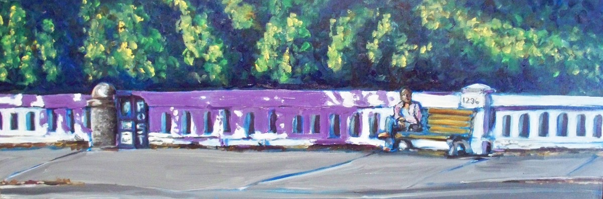

 I was heading into Palo Alto when I stopped for the light at University Ave at Woodland Ave. I was first at the limit line and saw this scene kitty corner from my position. I snapped a couple of shots with my camera phone before the light turned green. When I reviewed it at home, I thought this image would look great on one of those long landscape canvases. I would like to know if you think it works.
12x36 oil on canvas
The top is a modification based on a suggestion from an artist I really respect. Muted violet is what I'm looking for. This too pink?
Thursday....I uploaded a third version... little darker...
42 comments:
I like the design and the long canvas ... there's a mood that I like with the lone bench-sitter on a long span. However, the blue really detracts. Perhaps a muted violet? Something more neutral would keep the focus on the subject.
Thanks Kathy! I'll go try it now...
Love the trees and the blue shadow.
well done Sheila.
What a great longgggg canvas very original.
It works! I like the feeling of a warm sunny afternoon and the lone man on the bench.
Funny, my first comment was going to be that I loved the blue shadow, but then, Kathy is such a fabulous artist, that she is likely right. Perhaps I loved it too much. I recall the advice to kill off something you really love if it distracts the viewer from the center of interest. But I still love the shadow!
The long format is wonderful with this piece.
I like this painting - especially on the long canvas. I agree with Kathy. The blue seems a bit too intense and it attracts my eye straight to it. The long sidewalk, long fence, and long bench are perfect. Nice composition and nice painting!
Maybe periwrinkle blue? I love the long canvas.. perfect for the scene. Super design and painting!
I'm a sucker for loooong canvases. I like the idea of muted violet... it does look a little too "pinky" to me... but that could just be my monitor :)
Wonderful composition. Have to agree about the blue.
Sheila - nice work! I really like the long format - perfect for your subject. I like the one you revised. If you're tempted to still play with it, I might try the shadow a bit more muted, but then again everyone's monitors read differently. I think the park bench is fab!
Love the long canvas, Sheila! I'm going to stay away from commenting on the color because you know that I love crazy color. Shhhhhh.... love the pink....shhhh...lol
Love the format Sheila, and though I like the blue shadow, the muted violet would serve the subject...or maybe a muted blue?
Great piece... love the long feel. I'm leaning toward the blue shadow but a little tweaked on it's intensity.
thinking the violet looks a bit too strong--but it is on the right track. Great painting!
You are very versatile, Sheila! And clever of you to identify this as a topic for a painting. The colors and modernity are refreshing and I love the rhythm of the design!
Hi - I think the violet is too strong and needs to be neutralized (gray it with its complement to neutralize it). It detracts from the subject as is. But, the rest is great!
Gosh but this is a wonderful composition for this canvas, Sheila!! Gorgeous!!
Sheila...I love the long format! The composition is great...color choices are fresh...the shadows are terrific but would suggest toning down the blue. Happy Painting!
This is a great composition Sheila, and I agree about the blue shadow, just tone it down. I do like the variation of hues in the shadow, wonderful.
I think they both look great!
Hi Sheila,
In first i want to tell you thank you very much for you kind messages let on my blog. Léo and me were very happy to read them. Again thank you.
I like this format you use to this painting. The light is interesting and the shadow is wonderful!
I would like to sit on this bench with the sun on my face. I like the atmosphere too.
Kisses
The violet looks very pink on my monitor. Maybe you could split the difference and go with something between the blue and violet. Hard to go by what people say on the web though as everyone's monitors could be so different. Maybe they will come up with a standard universal monitor test or regulator some day. LOL! Great subject and composition though. I'm sure you will make it wonderful as a painting.
The darker muted violet looks great, Sheila. Love the long format.
Sheila, the panorama works great for this piece...very comfortable and inviting. The shadow? I think a happy medium between the lower blue and the uppermost pinkish-violet, would come closer to the shade. Oh, and the previous freesias are really quite nice. Spring and flowers...perfect...and flowers are up for WTTW (hint, hint) Keep up the great work and cool spirit.
I love those times where an image comes into our view while driving or walking and we think that we must paint it. Serendipitous moments. Rather than searching for something to paint, the image finds us. That is why I always carry a camera! I really like the long format. It is an interesting fence here, and the one person in the picture really tells a story. I think I like #3 the best.
Hi Sheila, I found my way here via another blog...your work is beautiful, you are so talented. Fascinating also that you were a forensic artist...that kind of work has always fascinated me and I must admit, I'm hooked on anything I can watch on tv on that subject. It must have been interesting and gratifying work.
Ruth
I love this composition. If I saw this scene, as you did, I probably would not see it as a painting subject, but it certainly does work. I like the first version, but I think more gray in your violet would work better. That's just my opinion for what its worth. Great job.
This is a great piece Sheila - the subject, the composition and mostly the shape of the canvas just WORK! The colour change suggested by Kathy was a good one.
It's art, Sheila. Go with your gut.
Great on that long canvas...
Sheila!
Good call!
The shadows of the top one look the most natural, although the blue of the bottom one is kind of eye-catching too!
-Dean
I agree with Kathy. too strong. How about a mixture of the blue and violet. Toned down or grayed. Great concept. Like the lone figure and where he sits. Love the size you are thinking of.
Have you considered...perhaps painting as a monochrome? Then we get the whole color issue thrown out of the discussion. OR perhaps if attempted in a limited palette of two complementary colors (perhaps an earth yellow and a muted violet)?
The pattern of the repeated 'windows' is quite interesting. I know if it was me I'd get out my straightedge and bring the horizontals into formation, but that's just me. And of course (being inherently lazy) I would minimize the foliage in the back, and try and push it way, way back.
I do very much like the long composition, and the bright blue I personally find quite pleasing. And, Sheila, I always love that you push the envelope!
Hi Sheila, I like the long format and your background vegetation is terrific. The purple is great complement to the yellow bench. Great job!
Sheila, it's always so difficult to modify a part of the painting in response to a critique. I think you are on the right track. I see that a few people said to grey the shadow a bit more -- neutralize with the complement. I agree with that suggestion.
Love the perspective and long format you chose. Feels like I'm walking by! Great Job!
Hi Sheila You already have a shadow color going on the sides of the balustrade (railing). Why not use that. The soft blue gray color, maybe a bit darker as it is a cast shadow rather than the shaded side of an object. I think this would unify the whole stone element and make the point without over emphasis. All of the other colors in the painting are fairly realistically portrayed so the colorist shadow is sort of an anomaly? (I'm drawing on my years of doing hundreds of architectural renderings!)
Wonderful as always! Sheila I have passed the Happy 101 Award to you. Please visit my blog when you can to check out the rules.
Hugs!
I like that long skinny format. These look great, Sheila.
yooooo hoooooooooo sheila---new painting ! new painting! tap tap tap (fingers drumming on table)
You'll probably get as many opinions as there are artists! lol. I admire your exploration--I'm forever lightening, darkening, intensifying, neutralizing to try to shift the focus to what's important. I'd neutralize and cool, and/or boost color in the figure to counterbalance.
I like the long composition and the one lone bench. I like the blue reflection. Your painting with the flowers is really very nice! I am new to your blog.
I like the blue, but prefer the other more subtle colours perhaps! Great atmosphere in the painting though!
Sheila, I'm certain I commented on this painting, yet I don't see it!
The sunshine and setting is peaceful.
Hope thing are well! Hope to see another painting!
Take care!
Post a Comment